When we said that our product was built with recruiters, it wasn’t just a sales pitch. It wasn’t just built for them but it was literally how our platform was created, grown, bringing hundreds and thousands of conversations, successful placements, Slack messages, job interviews, and so on.
Should this make us different? We didn’t build a one-size-fits-all tool and expect it to work for international recruiters. Instead, we listened to their real frustrations, saw what slowed them down, and aimed to address the problems in their day-to-day workflows in a way that actually matters.
Here’s what these recruiters taught us, and how that feedback made the platform better for everyone.
Top 5 Most-Requested Features and What We Did About Them
Great functionality can make or break any experience. In a world where user experience has become one of the most crucial aspects of digital products, often making or breaking the success of a project. In fact, design and usability make up 94% of first impressions and strong UX can increase conversion rates by a staggering 400%
So, what did we actually do to make the platform more user friendly? We listened, and these are the things we heard:
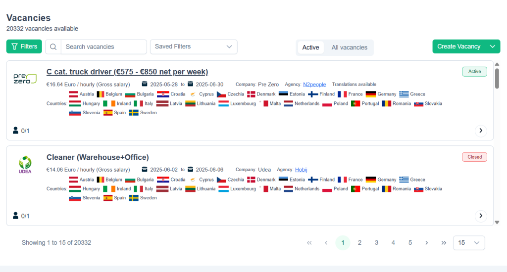
1. “Can I search by city, not just country?”
The problem was that recruiters who were placing candidates in the Netherlands wanted more local control, having more specific answers for workers who often ask where they will be going, not just what they will be doing.
The solution was simple: we added city-level search filters so recruiters can promote vacancies easier in areas that make more sense for candidates both logistically and geographically.
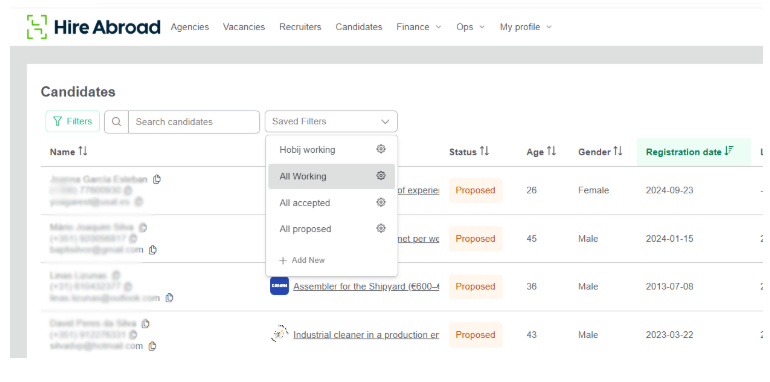
2. “I need to filter jobs by language!”
The problem was a given: having to comb through hundreds of irrelevant vacancies or having to translate them not only can slow you down but even waste your time and miss out on great candidates and opportunities.
More specifically, in our case, Portuguese-speaking recruiters didn’t want to waste time translating Polish warehouse job ads, and they had a point. The solution was also straightforward. We introduced language filter settings both for candidate profiles and jobs, which managed to help recruiters save time and increase response quality
3. “Why am I seeing the same vacancy three times?”
Seeing the same job and with only a few minor variations made the vacancy feed cluttered and confusing, straining the eye and user experience. Also, it made quickly skimming through the offers a lot more difficult than it should have been.
To solve this frustrating problem, we implement duplicate deduction and smart merging. This shows recruiters the most relevant vacancies to aid them in their campaigns.
4. “I’m working from my phone—why is this screen so hard to use?”
The importance of responsive design cannot be understated. This is what we’ve experienced first hand when feedback from our recruiters showed problems with accessing and using the site via mobile. As we found out, their phones are their main devices in most cases, especially during field recruitment.
This is when we transitioned to a full-responsive design, meaning that we readdressed certain key flows, like job editing, vacancy browsing and candidate chat, so they can be 100% mobile friendly. This simple, yet effective tweak has proven to be a huge leap in improving recruiter productivity and making them feel more at home on the platform.
5. “I don’t know what works and what doesn’t.”
There’s no real insight-driven recruitment without data. With no structure, recruiters were guessing which roles and countries they should focus on to boost their figures.
We added role-by-role performance insights, and our success managers now proactively recommend which vacancies to prioritize based on performance across the platform. Needless to say, this also was a game-changer in making the platform better suited for the needs of recruiters who want to maximise their potential and help as many candidates as they can.
Human Feedback Instead of Fancy Features
In the world of development, losing track of what really matters and chasing shiny features is rather easy. Everyone wants eye-catching designs, cutting-edge tech, like AI, or predictive anything. While all those features have the potential to help, in international recruitment, where workflows differ by language, country, or even nationality, a human-informed design that really makes the difference.
So, instead of guessing, we asked:
- What slows you down?
- What makes you trust (or mistrust) a job post?
- What makes you decide to share a vacancy today?
Afterwards, we built the necessary tools to help recruiters solve these problems instead of relying on our assumptions or by relying on development recommendations from experts far away from the field.
Other than that, we also built a culture of listening. Every piece of feedback, workshop, support ticket, and one-one-one success manager meeting has become an active building block. We reworked flows, redesigned filters, and even scrapped features that didn’t serve real-world use cases. That made all the difference.

In practice, this means recruiters now spend less time clicking and more time placing. Less translating and more matching. Less guessing and more growth. The result was a platform that fits the needs of recruiters.
Because when the product is shaped by the people who use it daily, it doesn’t need a flashy pitch. It just works better.That’s what our recruiters taught us.
How Recruiters Shaped Our Philosophy
Every platform is “user-centric.” For most, it’s just a buzzword..what it means for us, it’s simple: We prioritise the most painful features instead the most requested ones.
For example:
- A flashy resume parsing tool didn’t beat out “please fix job filtering by region.”
- A smart job description generator didn’t rank above “I can’t preview this vacancy on mobile.”
When tech solves the right problems, usage goes up, along with trust. In our case, hires also go up.
Tech-Enabled Hiring Still Needs Human-Centered Design
Recruiters don’t need more buttons but better outcomes. The latter only comes from platforms that address actual frustrations and understand what recruiters actually do during a workday.
Hire Abroad became better because recruiters told us what wasn’t working and trusted us to fix it. Every recruiter who ever filed a bug, made a request, or told us their frustrations actually played a pivotal role in making the platform better.
Thank you. You’re the reason we’re building something worth using.
On a similar note, if you have something to add or want to learn more about the platform, feel free to connect with us today.